A selection of projects from my years as a Brand Designer, Special Projects at Cloudflare, a SaaS focusing on delivering security, reliability, and speed across the Internet. These projects range from campaign and event branding and design, to illustration and art direction for animated videos, to social media template creation and implementation.
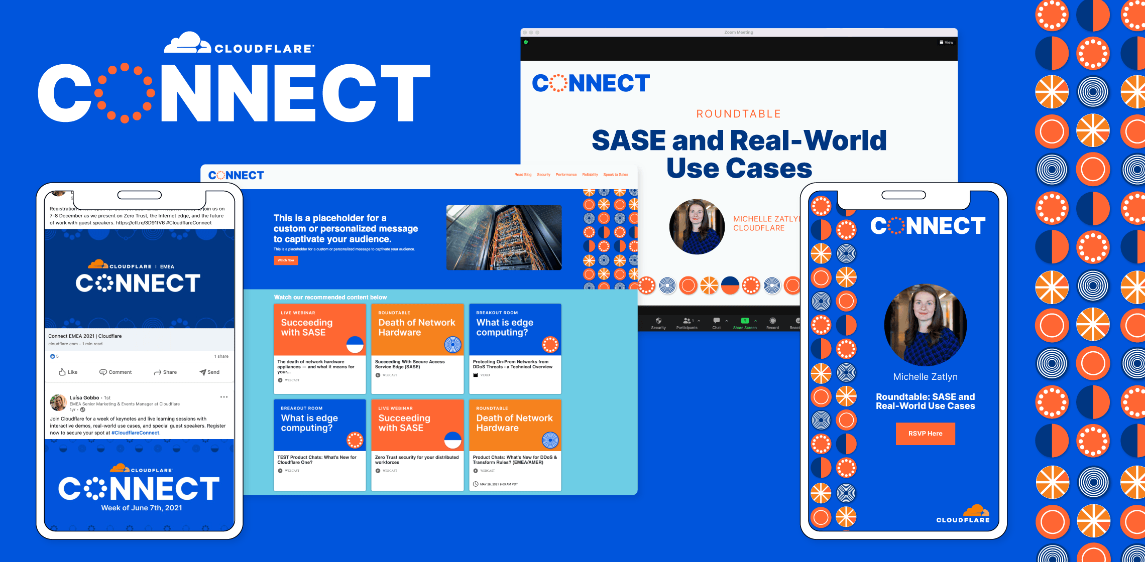
Cloudflare Connect – event branding, campaign template design, and platform component design for the (virtual) annual Cloudflare Connect event
"City clouds" illustrations created for offices in New York and Paris
Explainer videos – creative direction, storyboarding, and illustration for a series of branded videos, developed in partnership with an external animation studio
Social media templates created for Cloudflare Connect, UK Black History Month, and American Black History Month – the latter 2 in partnership with ERG stakeholders
Swag/packaging design – final printed packaging and dieline, part of marketing team initiatives to send branded swag to current and potential customers